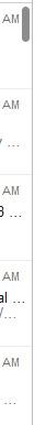
As you can see from the image above, the scroll bar is a minimal blob that alters in size depending on the total amount of items in its list.
Creating the demo application
Fire up Visual Studio and create a WPF Desktop application, and paste the following code over the existing Grid that is in the MainWindow.xaml file.
<Grid Margin="50">
<ScrollViewer>
    <ListView>
        <ListViewItem Content="Test" />
        <ListViewItem Content="Test" />
        <ListViewItem Content="Test" />
        <ListViewItem Content="Test" />
        <ListViewItem Content="Test" />
        <ListViewItem Content="Test" />
        <ListViewItem Content="Test" />
        <ListViewItem Content="Test" />
        <ListViewItem Content="Test" />
        <ListViewItem Content="Test" />
        <ListViewItem Content="Test" />
        <ListViewItem Content="Test" />
        <ListViewItem Content="Test" />
        <ListViewItem Content="Test" />
        <ListViewItem Content="Test" />
        <ListViewItem Content="Test" />
        <ListViewItem Content="Test" />
        <ListViewItem Content="Test" />
        <ListViewItem Content="Test" />
    </ListView>
</ScrollViewer>
</Grid>
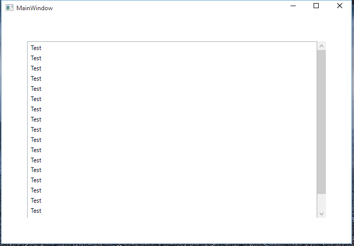
As you can see I have wrapped a ScrollViewer around the ListView, the reason I have done this is so I can style the ScrollViewer separately. This gives you the default Windows scroll bar which, as you can see takes up some space.
Now the next thing to do is go in to App.xaml and paste the following style in to your Application.Resources
<!--Scrollbar Thumbs-->
<Style x:Key="ScrollThumbs" TargetType="{x:Type Thumb}">
<Setter Property="Template">
    <Setter.Value>
        <ControlTemplate TargetType="{x:Type Thumb}">
            <Grid x:Name="Grid">
                <Rectangle HorizontalAlignment="Stretch" VerticalAlignment="Stretch" Width="Auto" Height="Auto" Fill="Transparent" />
                <Border x:Name="Rectangle1" CornerRadius="5" HorizontalAlignment="Stretch" VerticalAlignment="Stretch" Width="Auto" Height="Auto" Background="{TemplateBinding Background}" />
            </Grid>
            <ControlTemplate.Triggers>
                <Trigger Property="Tag" Value="Horizontal">
                    <Setter TargetName="Rectangle1" Property="Width" Value="Auto" />
                    <Setter TargetName="Rectangle1" Property="Height" Value="7" />
                </Trigger>
            </ControlTemplate.Triggers>
        </ControlTemplate>
    </Setter.Value>
</Setter>
</Style>
<!--ScrollBars-->
<Style x:Key="{x:Type ScrollBar}" TargetType="{x:Type ScrollBar}">
<Setter Property="Stylus.IsFlicksEnabled" Value="false" />
<Setter Property="Foreground" Value="#8C8C8C" />
<Setter Property="Background" Value="Transparent" />
<Setter Property="Width" Value="8" />
<Setter Property="Template">
    <Setter.Value>
        <ControlTemplate TargetType="{x:Type ScrollBar}">
            <Grid x:Name="GridRoot" Width="8" Background="{TemplateBinding Background}">
                <Grid.RowDefinitions>
                    <RowDefinition Height="0.00001*" />
                </Grid.RowDefinitions>
                <Track x:Name="PART_Track" Grid.Row="0" IsDirectionReversed="true" Focusable="false">
                    <Track.Thumb>
                        <Thumb x:Name="Thumb" Background="{TemplateBinding Foreground}" Style="{DynamicResource ScrollThumbs}" />
                    </Track.Thumb>
                    <Track.IncreaseRepeatButton>
                        <RepeatButton x:Name="PageUp" Command="ScrollBar.PageDownCommand" Opacity="0" Focusable="false" />
                    </Track.IncreaseRepeatButton>
                    <Track.DecreaseRepeatButton>
                        <RepeatButton x:Name="PageDown" Command="ScrollBar.PageUpCommand" Opacity="0" Focusable="false" />
                    </Track.DecreaseRepeatButton>
                </Track>
            </Grid>
            <ControlTemplate.Triggers>
                <Trigger SourceName="Thumb" Property="IsMouseOver" Value="true">
                    <Setter Value="{DynamicResource ButtonSelectBrush}" TargetName="Thumb" Property="Background" />
                </Trigger>
                <Trigger SourceName="Thumb" Property="IsDragging" Value="true">
                    <Setter Value="{DynamicResource DarkBrush}" TargetName="Thumb" Property="Background" />
                </Trigger>
                <Trigger Property="IsEnabled" Value="false">
                    <Setter TargetName="Thumb" Property="Visibility" Value="Collapsed" />
                </Trigger>
                <Trigger Property="Orientation" Value="Horizontal">
                    <Setter TargetName="GridRoot" Property="LayoutTransform">
                        <Setter.Value>
                            <RotateTransform Angle="-90" />
                        </Setter.Value>
                    </Setter>
                    <Setter TargetName="PART_Track" Property="LayoutTransform">
                        <Setter.Value>
                            <RotateTransform Angle="-90" />
                        </Setter.Value>
                    </Setter>
                    <Setter Property="Width" Value="Auto" />
                    <Setter Property="Height" Value="8" />
                    <Setter TargetName="Thumb" Property="Tag" Value="Horizontal" />
                    <Setter TargetName="PageDown" Property="Command" Value="ScrollBar.PageLeftCommand" />
                    <Setter TargetName="PageUp" Property="Command" Value="ScrollBar.PageRightCommand" />
                </Trigger>
            </ControlTemplate.Triggers>
        </ControlTemplate>
    </Setter.Value>
</Setter>
</Style>
This is the style for the Apple scroll bar - once this is pasted in App.xaml the styling will take effect immediately and you'll be able to see that the scroll bar in design view has changed to the one that we see in the initial example.
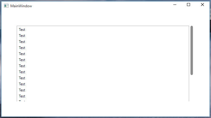
And there you have it! An Apple style scroll bar that will take effect in your application and take up less space than the default Windows one.
